01
OVERVIEW
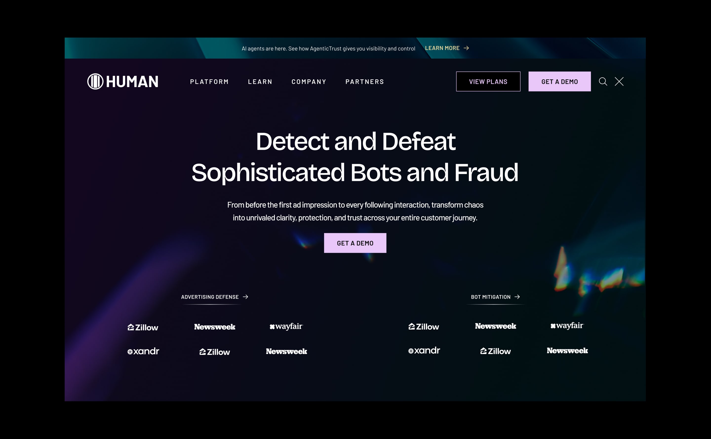
Human Security protects over 20 trillion digital interactions weekly, detecting bots, fraud, and abuse at a scale most companies can't fathom. When they came to us, the product had outgrown the website. The visual identity felt generic, the navigation was fragmented, and the experience didn't reflect the sophistication or confidence of what was actually being built. Our mandate was a full redesign: new visual identity, new information architecture, new interactions, all built to position Human as the definitive authority in cybersecurity.
02
PAINPOINTS / CHALLENGEGS
Human Security’s previous website faced several critical issues, including outdated navigation, inconsistent design, and a lack of visual cohesion. Key pain points included:
1. Disjointed layout and poor flow, making it difficult to convey the company’s story.
2. A confusing navigation system that didn’t effectively showcase the variety of solutions offered.
3. Inconsistent typography, graphics, and color usage, creating a fragmented user experience.
4. Dense, lengthy copy and sections that hindered user engagement and readability.
5. A dark and uninviting aesthetic that detracted from the overall user experience.
03
GOALS
The project’s goals were designed to differentiate Human Security in the market and build a site that exuded sophistication, trust, and innovation:
1. Establish a unique visual identity that reflects Human’s bold, offensive approach to cybersecurity.
2. Create memorable digital interactions that stand out across sales, social, and event platforms.
3. Increase engagement and conversion by providing relevant content and improving functionality.
4. Build a platform for personalized content, including calculators, assessments, and self-scheduling tools.
5. Continuously optimize through A/B testing, CTA tracking, and enhanced content delivery.
04
DESIGN PROCESS
We started with a Discovery Phase, conducting user research, analytics review, and stakeholder interviews to map the real pain points and identify conversion opportunities. From there we built the information architecture and content strategy before touching visual design.
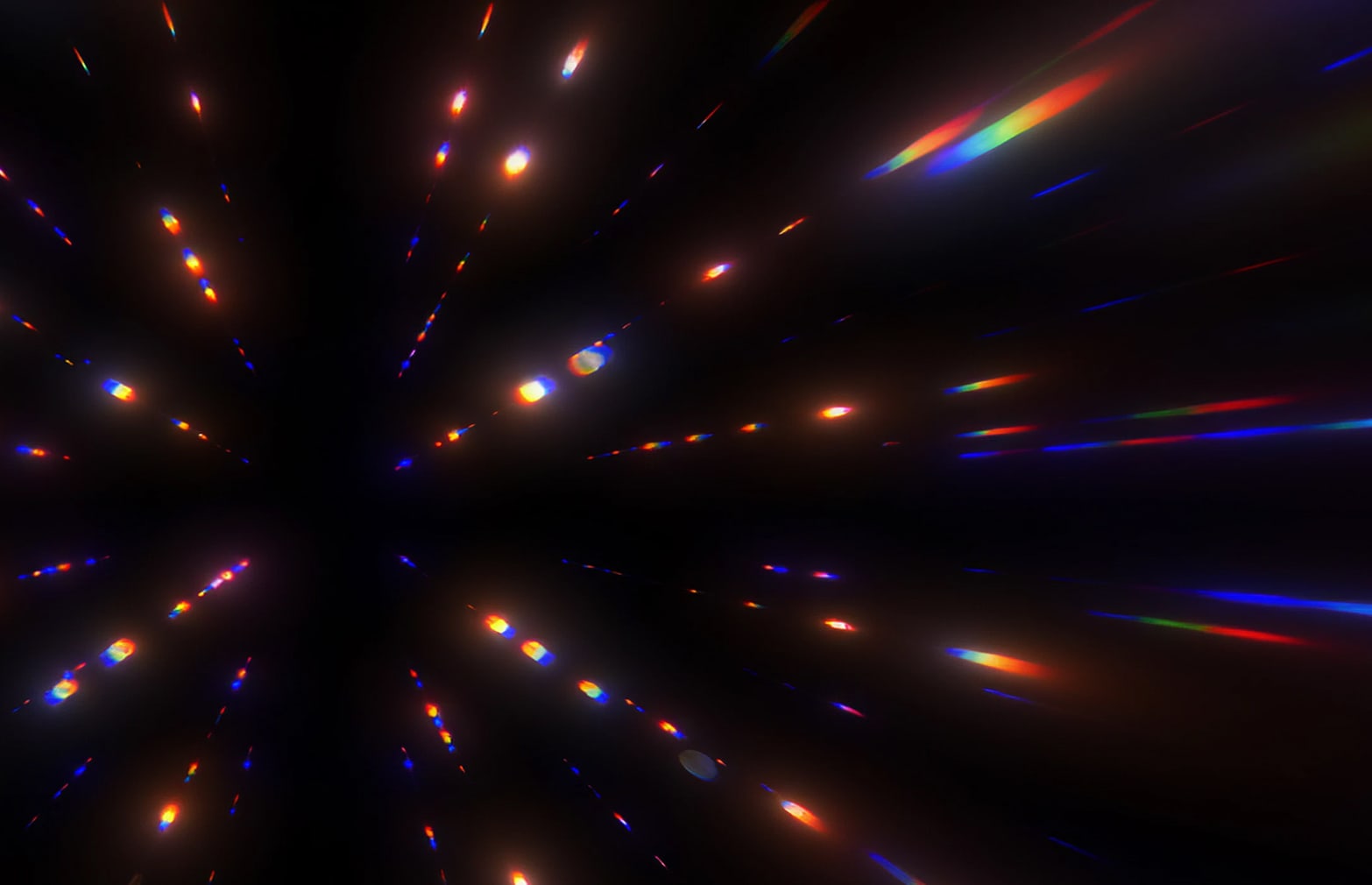
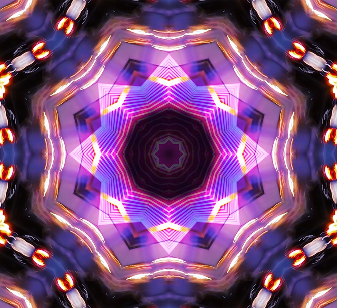
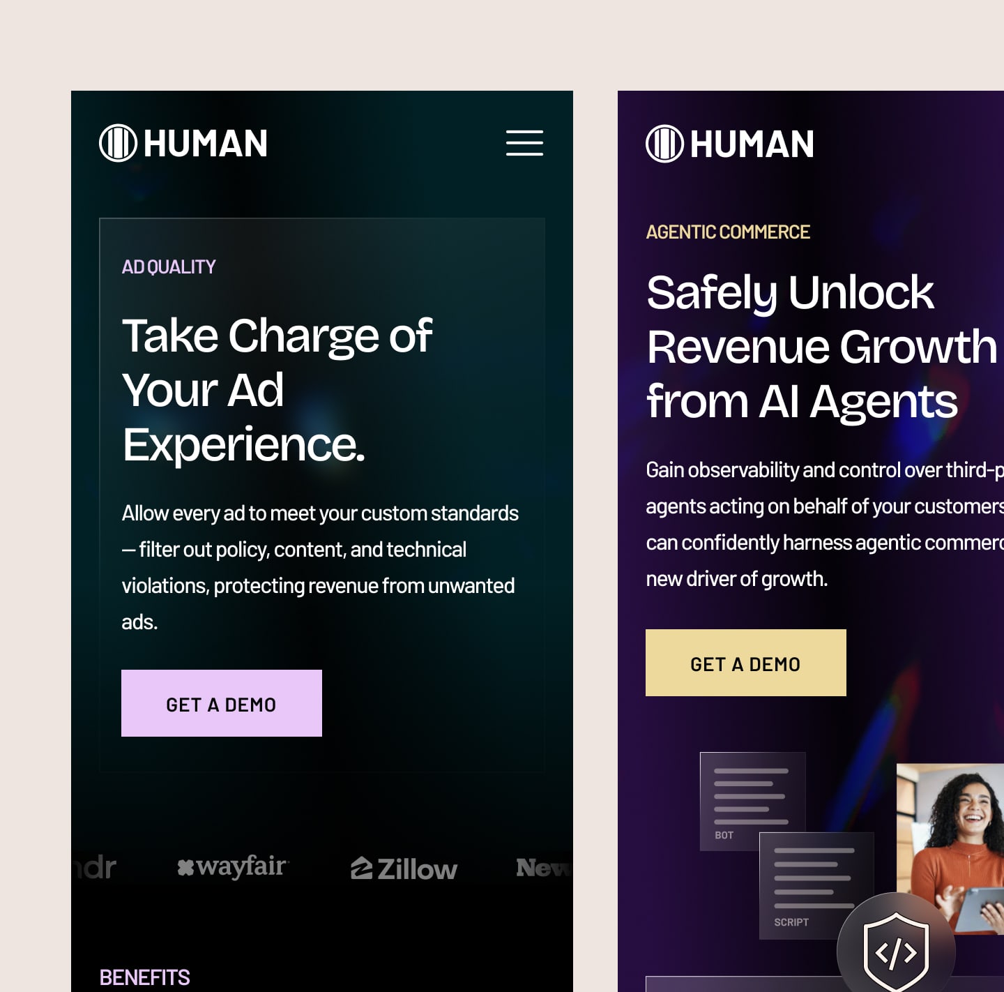
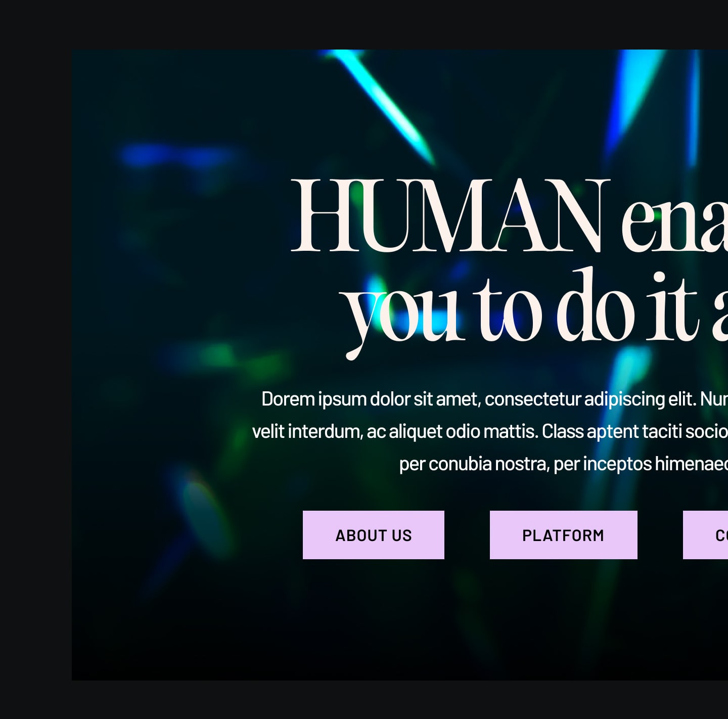
For visual direction, we developed two distinct moodboards deliberately. One leaned into the chaos and complexity of the threat landscape: dark, fragmented, kinetic. The other leaned into the solution: precise, confident, luminous. The client chose the latter, and that tension, technically sophisticated but visually clarifying, became the governing idea of the entire system.
From that foundation we built a full design system: type scale, color tokens, component library, interaction patterns, and graphic element guidelines. The system had to work across the website, social, and ad formats, so every decision was made with extension in mind, not just the homepage.
05
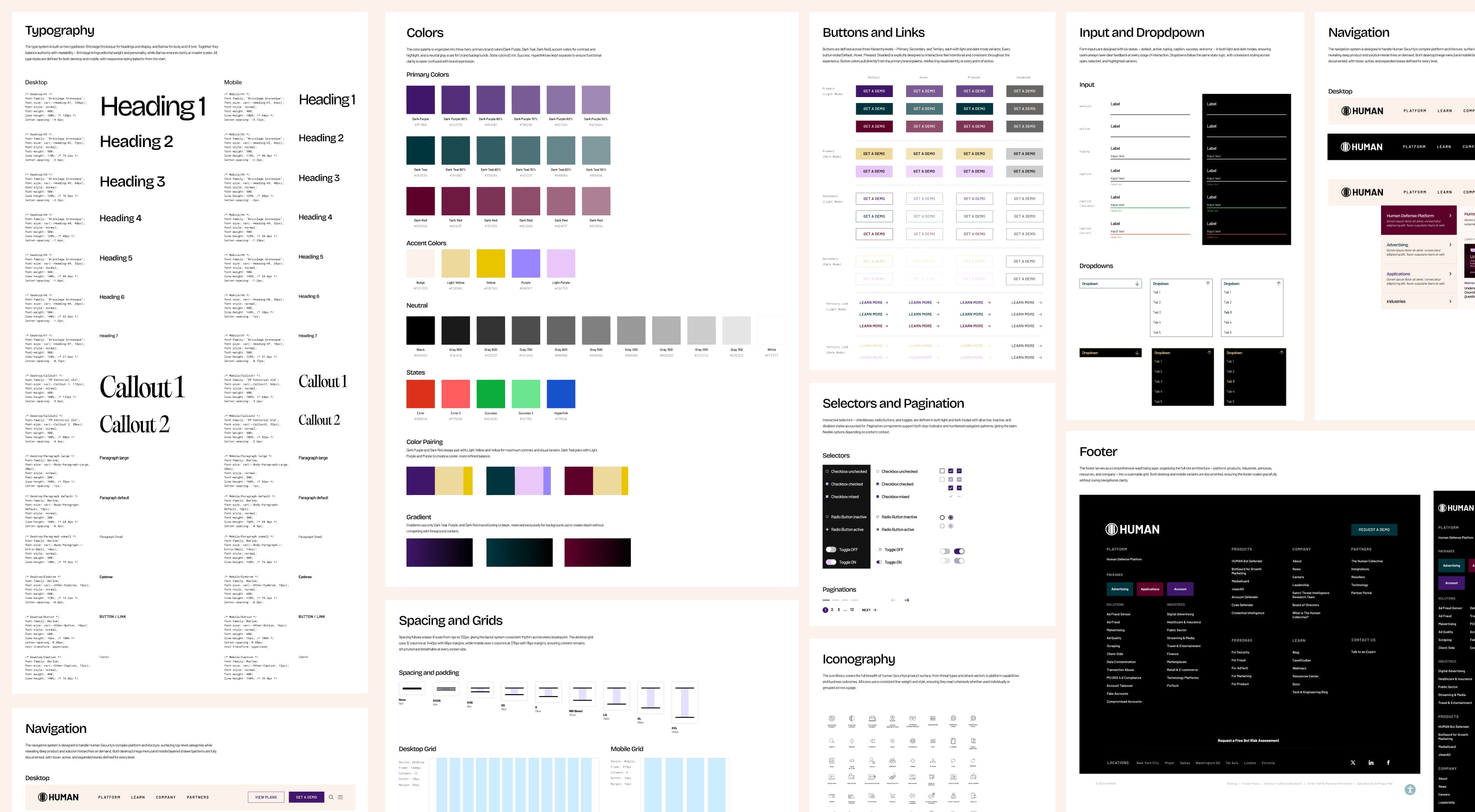
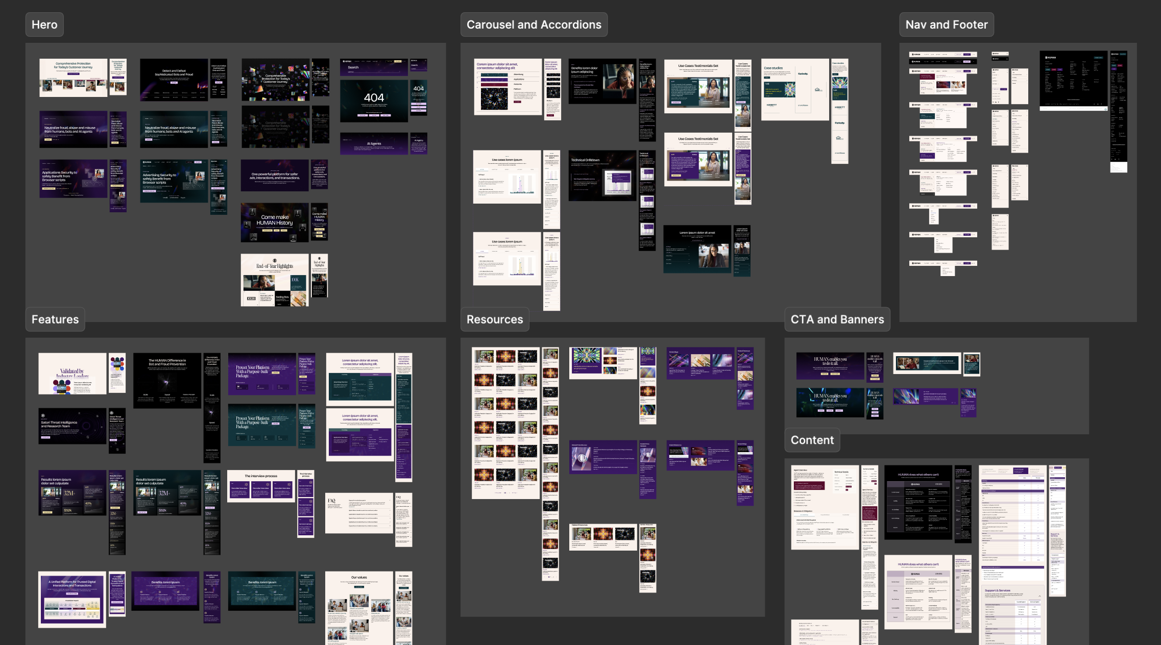
DESIGN SYSTEM & COMPONENT LIBRARY
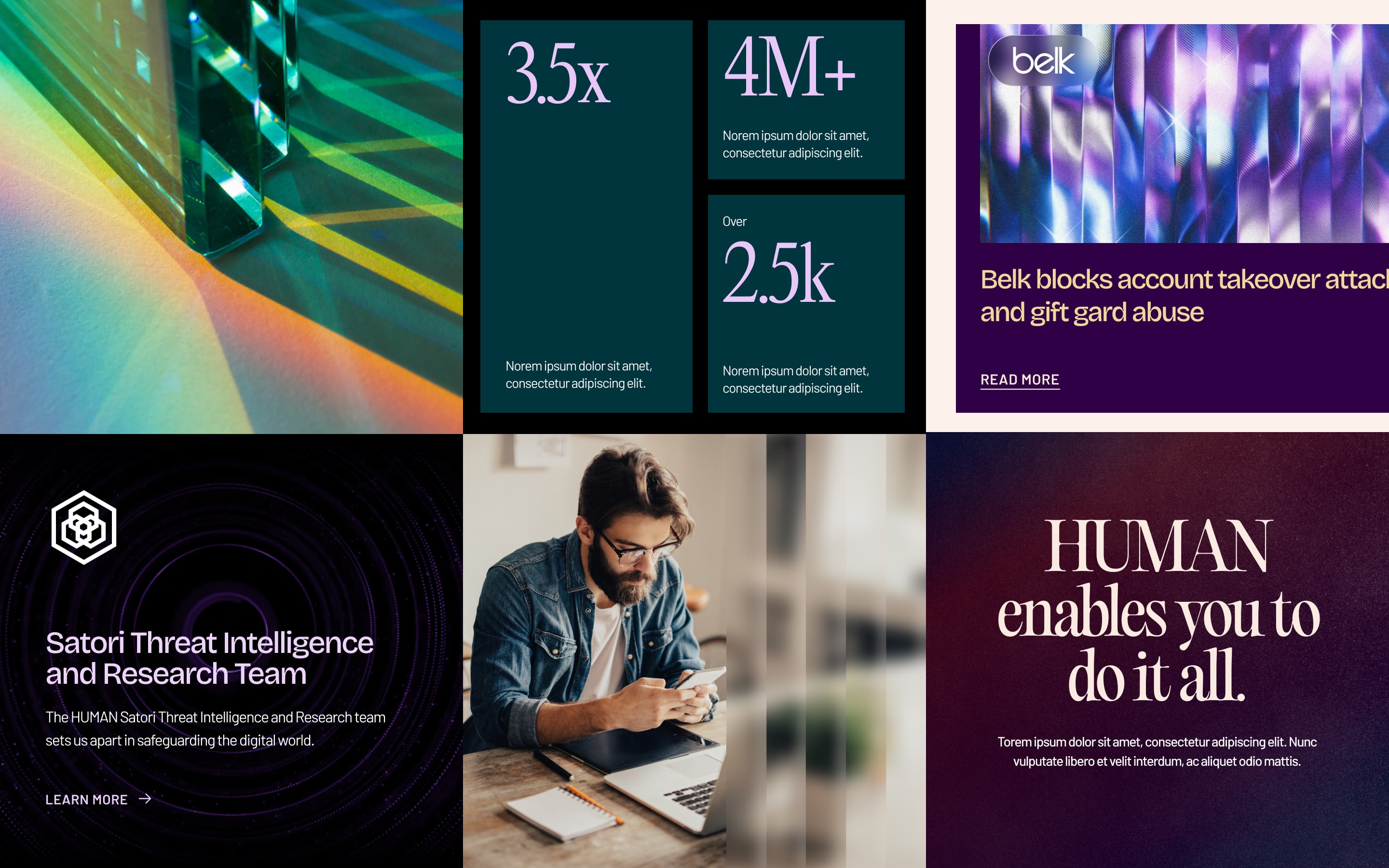
Every project at Baunfire starts with a system, not a set of pages. For Human Security, we built a comprehensive design system from the ground up, translating their new brand identity into a scalable visual infrastructure that could govern the entire site and extend into marketing and campaign work. The goal was simple: quality that holds up without requiring direct oversight on every decision.
Built on top of the style guide foundations, the component library is where the visual system becomes operational. Every section of the site is translated into a modular, reusable component, organized by function and documented across desktop and mobile, light and dark mode, with all interactive states accounted for. The goal wasn't just consistency for the current site. It was to give Human's internal team the freedom to build new pages, launch campaigns, and expand the product surface independently, without needing to reinvent design decisions that had already been made. The system is opinionated enough to protect the brand, and flexible enough to scale without us.
05
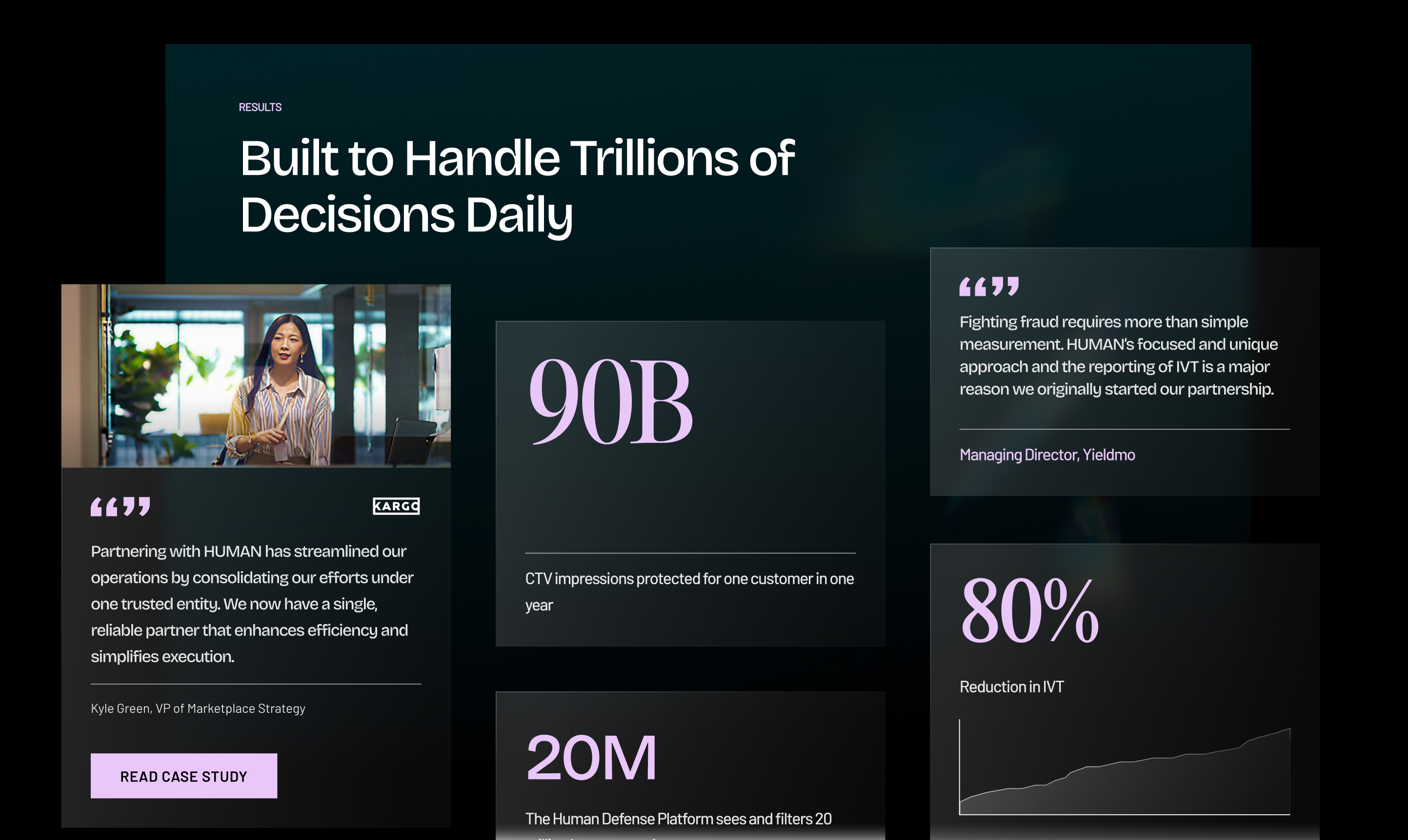
TAKEAWAY & OUTCOMES
The site launched January 16, 2025 and delivered measurable results almost immediately. Influenced S2+ opportunities increased 176% post-launch, with qualified pipeline value growing from $1.6M to $3.9M, a 144% lift. Organic sessions grew 27.5% YoY by August, non-branded search clicks were up 46%, and page 1 keyword rankings climbed 41% year-over-year. The redesigned homepage achieved a 25% bounce rate, well below industry benchmarks, and drove 30% more demo request clicks after the hero CTA was updated. The engagement became an ongoing retainer, with monthly performance reviews informing continuous iteration. The real outcome wasn't just a better-looking site. It was a website that worked measurably harder for the business.