01
OVERVIEW
Nomad Group is a modern commercial real estate firm in New York City that helps high-growth, VC-backed companies find, build, and manage workplaces they love. Unlike traditional brokerages, they offer an end-to-end service: brokerage, construction management, facilities management, and Flex by Nomad, their own move-in-ready office product. The challenge in positioning them wasn't the quality of the work. It was the brand. In a market where credibility is everything and legacy firms dominate, Nomad needed a website and visual identity that could hold its own against much larger, more established competitors.
We were brought in for a full website redesign paired with a brand refresh: new logo treatment, updated color palette, and a visual design language built specifically for their business. The goal was to make Nomad look and feel like the disruptive, future-forward real estate firm they already were.
02
PAINPOINTS / CHALLENGEGS
The discovery process surfaced clear problems. The previous website didn't lead with benefits, lacked persuasive copy, and didn't differentiate Nomad from competitors. Traffic had dropped 31% year-over-year, and organic engagement time from search was just 45 seconds. Visually, the brand wasn't keeping pace with the quality of the work. Multiple technical SEO issues including broken links, missing meta descriptions, and incorrect sitemaps were costing the brand discoverability. And critically, the full breadth of Nomad's capabilities, particularly Flex by Nomad and their construction management offering, wasn't being communicated clearly enough to convert high-intent visitors.
03
GOALS
We set out to solve four problems at once. First, refresh the brand identity to give Nomad the visual credibility to compete with legacy firms, without losing the human, relationship-driven personality that sets them apart. Second, redesign the information architecture so users could quickly orient to the right solution whether they were a VC-backed tenant, a landlord, or a prospective client. Third, build a design system that could scale across Nomad's growing suite of services and give their team the tools to maintain and expand the site independently. Fourth, lay a technical foundation for long-term SEO improvement, fixing existing issues and establishing a content structure that could be optimized over time.
04
DESIGN PROCESS
We started with a full discovery and strategy phase: a competitive audit across major CRE firms (CBRE, JLL, Cushman & Wakefield) and emerging competitors, audience persona development, and a detailed review of existing analytics and SEO health. This gave us a clear picture of both the gaps and the opportunities.
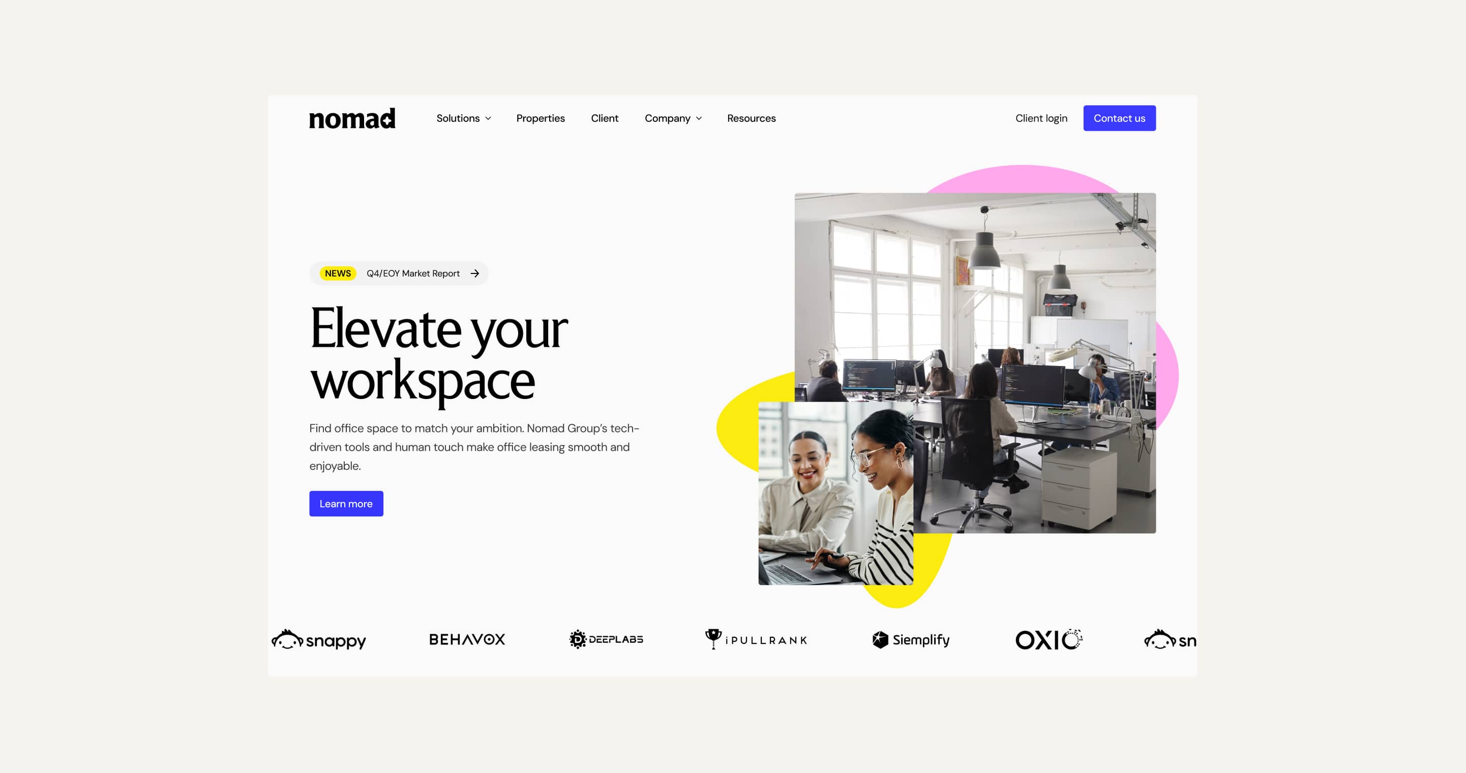
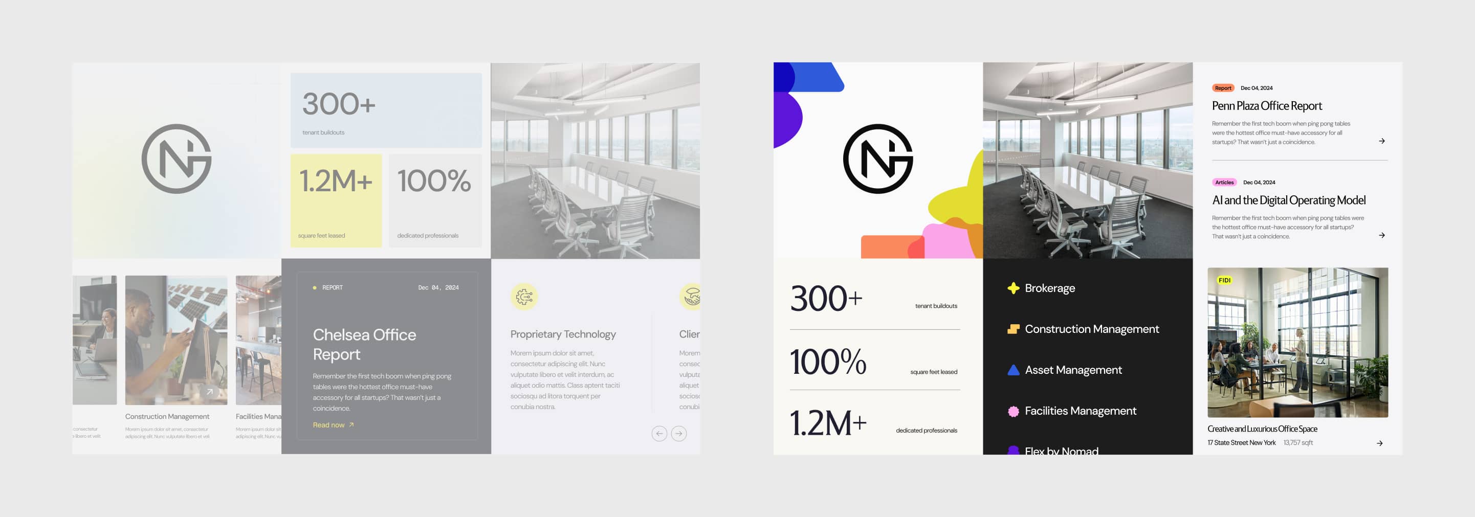
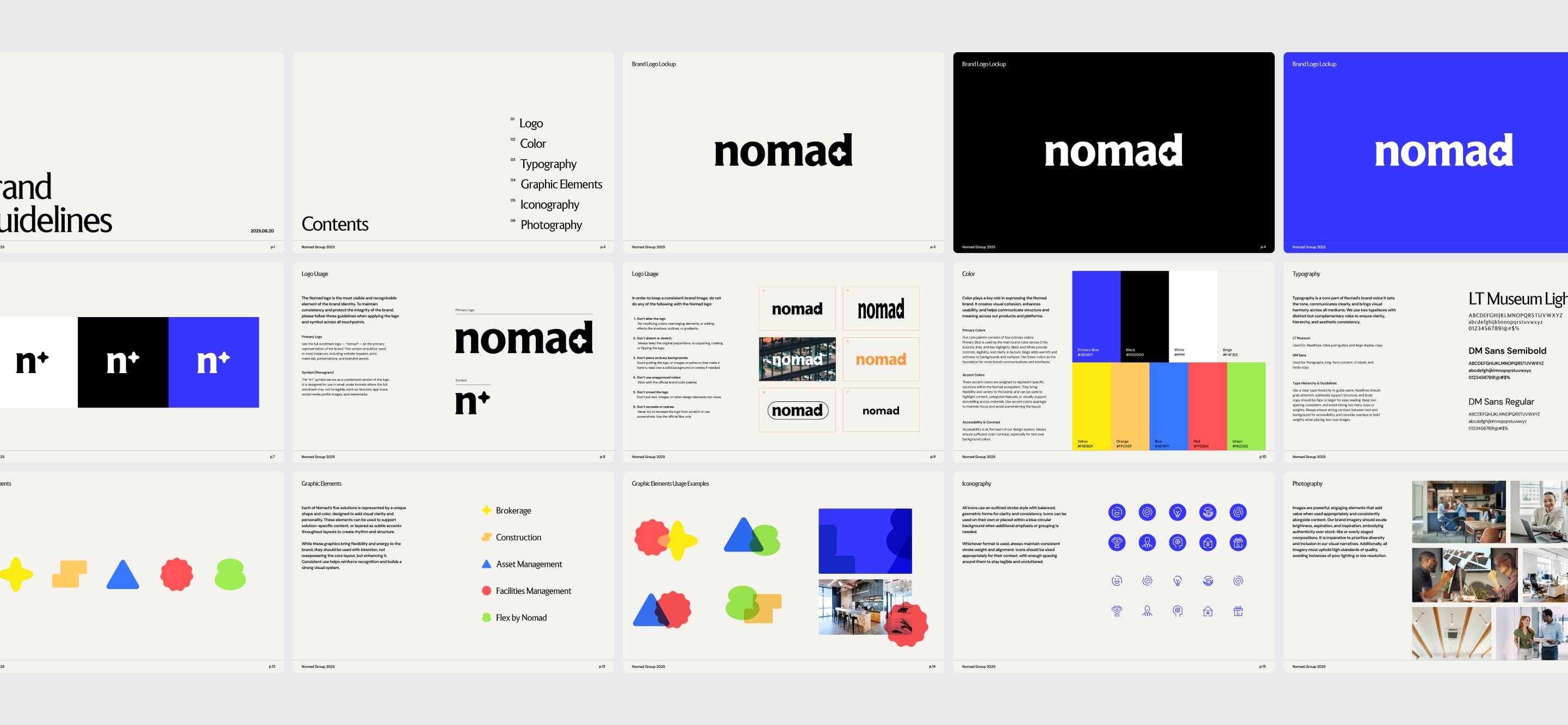
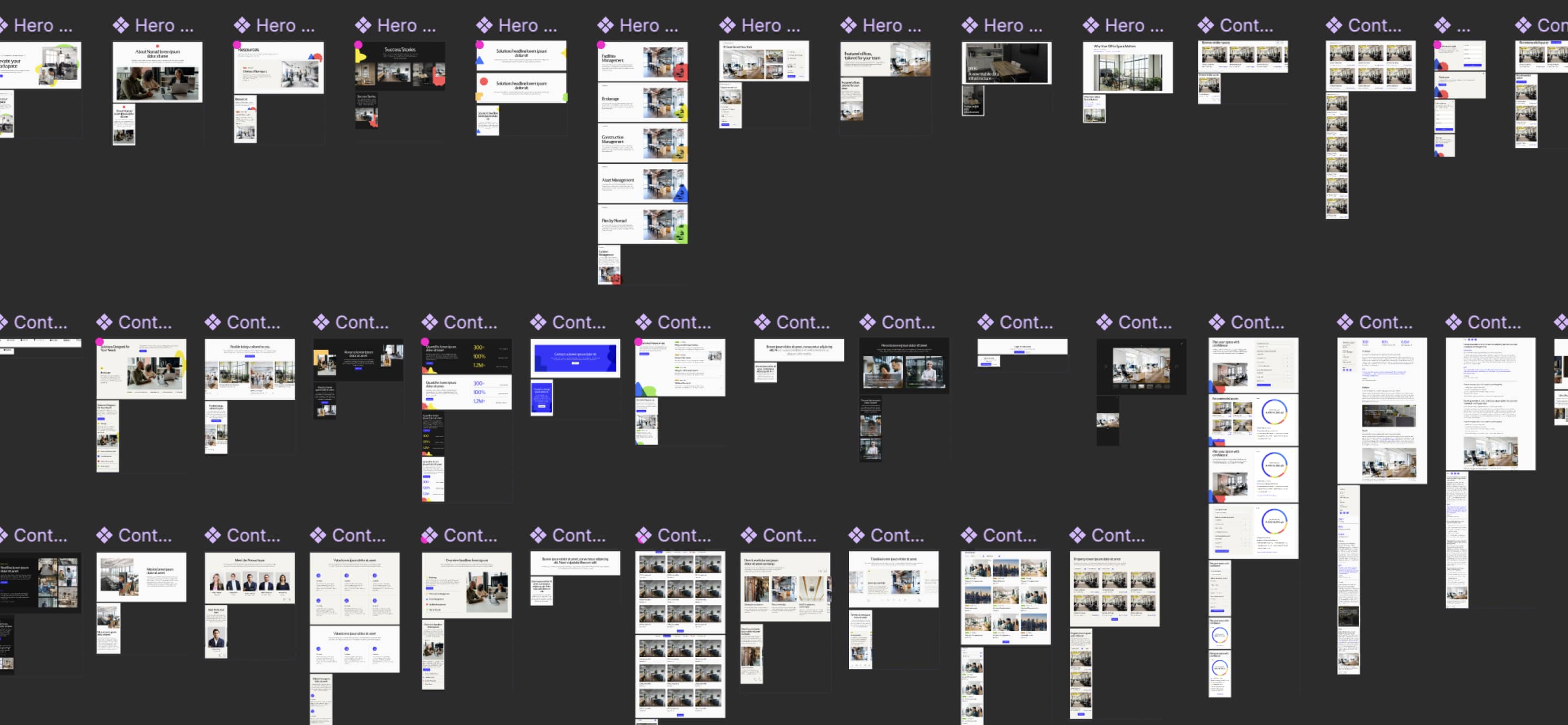
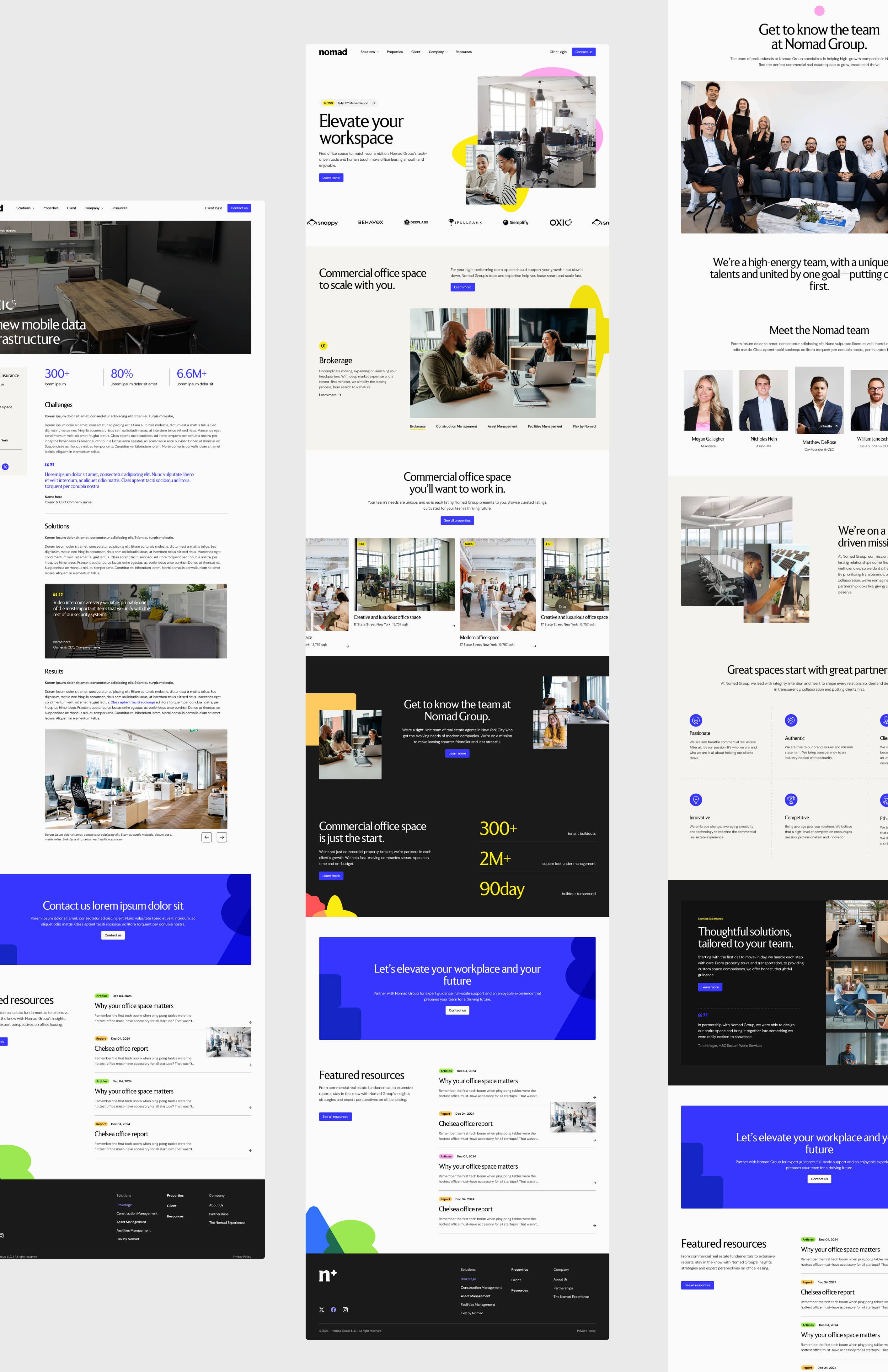
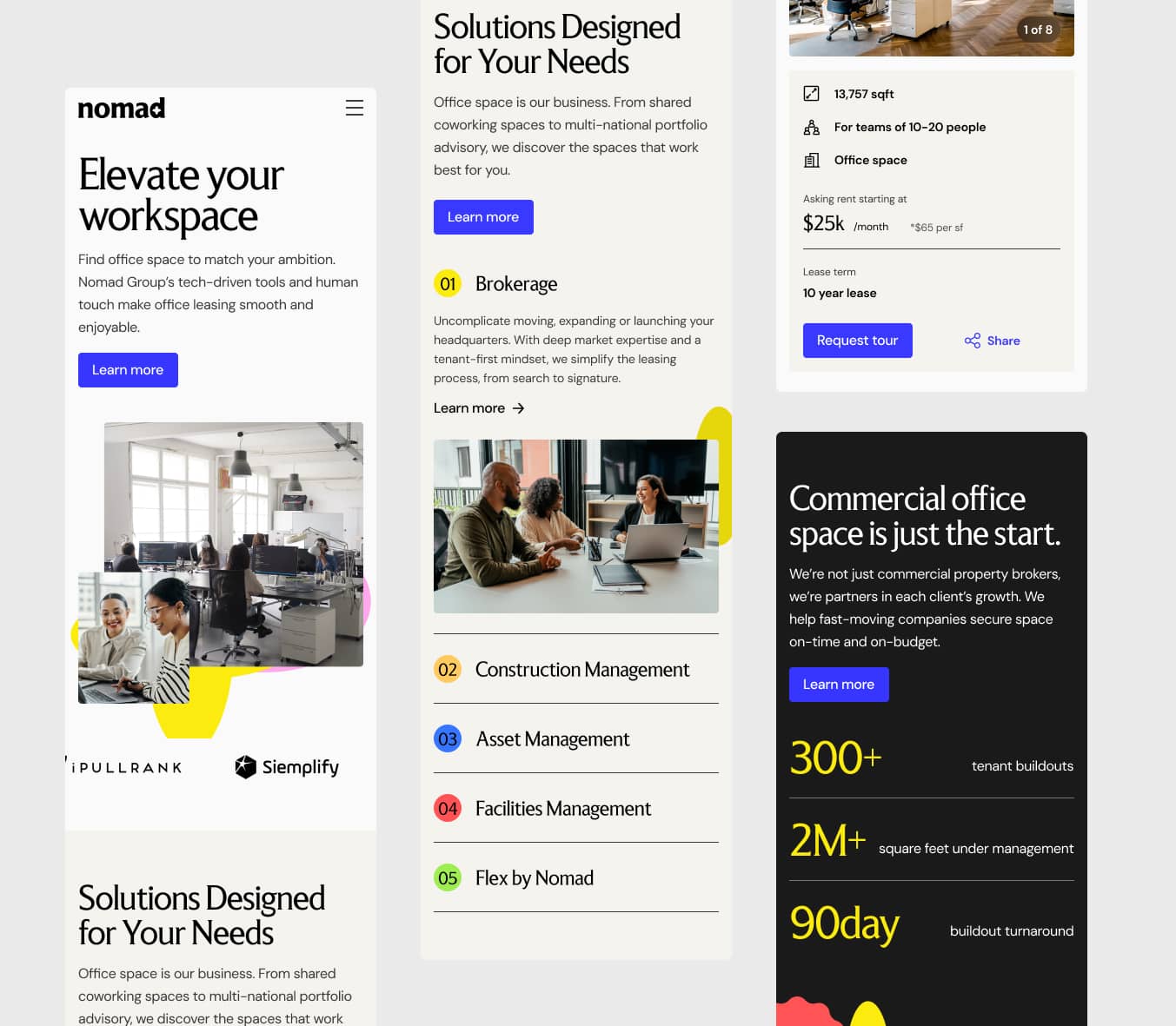
For the brand refresh, we updated the Nomad wordmark, introduced a refined color palette anchored in a confident blue with accent colors assigned to each of their five service lines, and developed a graphic elements system using bold geometric shapes. Each solution, Brokerage, Construction Management, Asset Management, Facilities Management, and Flex by Nomad, is represented by a distinct shape and color, giving the brand a visual language that's immediately navigable and distinctly Nomad. The result is a brand that feels fresh and modern without losing the warmth and accessibility that their relationship-driven business depends on.
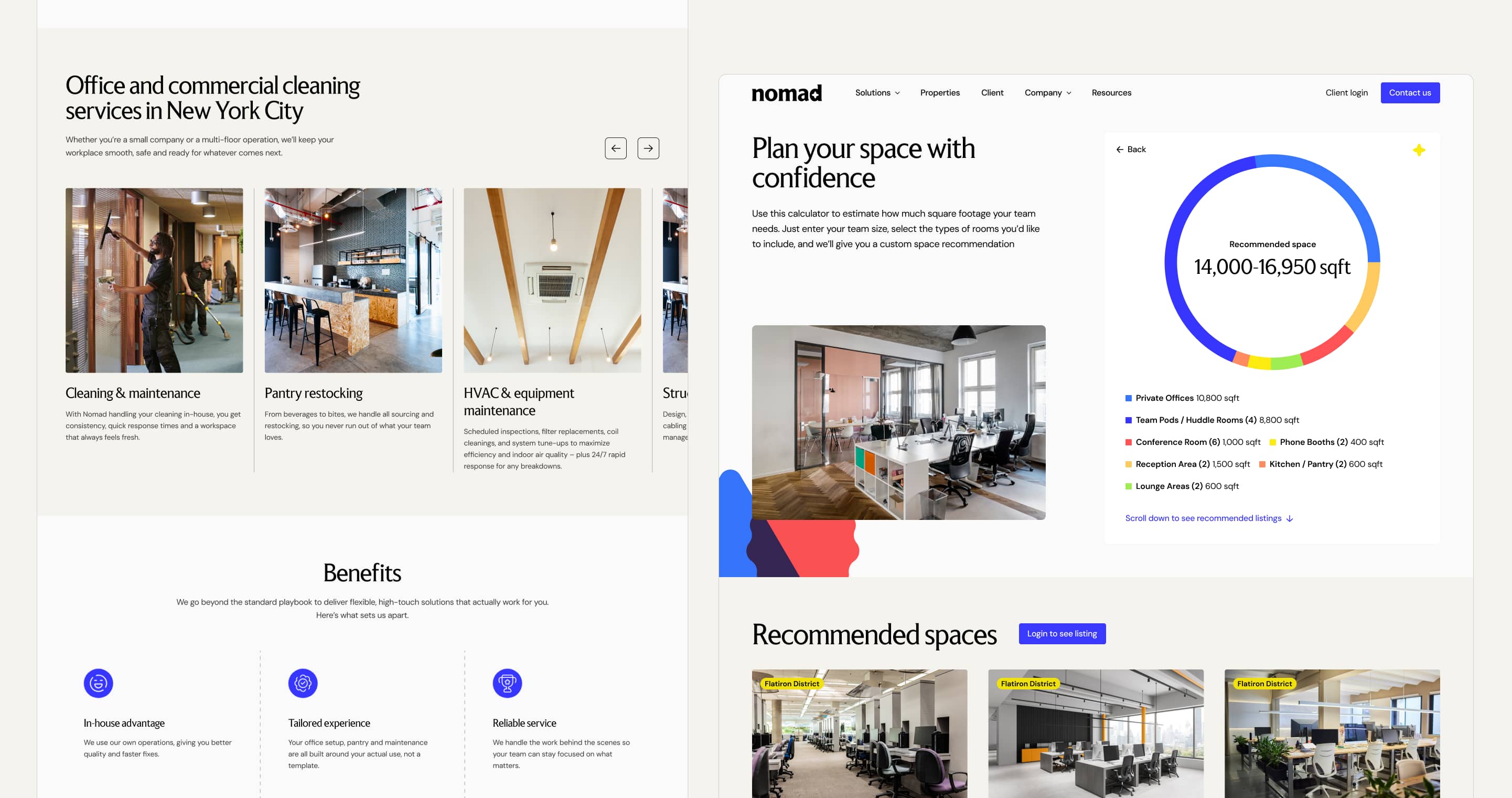
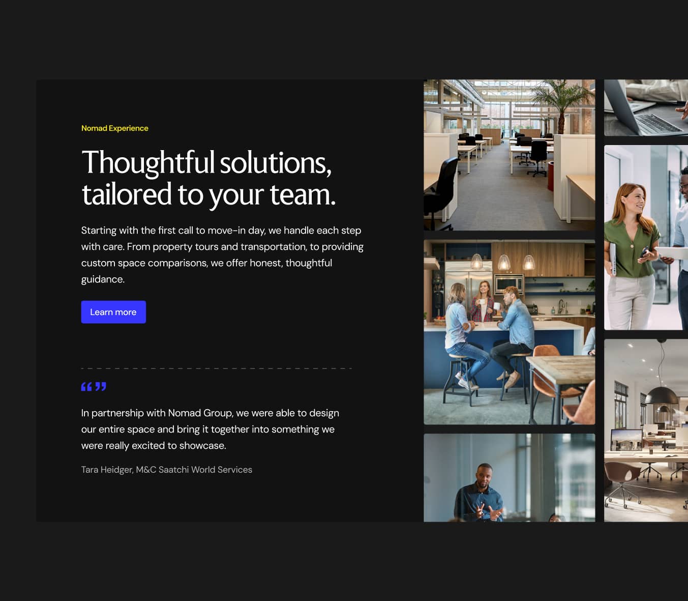
For the web experience, we restructured the information architecture around how users actually navigate commercial real estate decisions: by solution type, by property, and by company story. We designed interactive tools to support conversion, including a space planning calculator that estimates square footage needs based on team size and room configuration, helping users get to a recommendation faster and with more confidence.
05
DESIGN SYSTEM & COMPONENT LIBRARY
The design system for Nomad translates the refreshed brand identity into a scalable web language. The visual system balances two things that can easily work against each other: the precision and credibility of an enterprise real estate firm, and the warmth and approachability of a relationship-first business. Clean typography, generous white space, and a restrained color palette keep the experience professional. The bold geometric graphic elements and energetic accent colors inject personality and help users orient across service lines at a glance.The component library gives Nomad's team the freedom to build and expand the site without starting from scratch on every new page. Every section type is documented and organized, so the visual consistency of launch day holds up six months later when the team is adding new listings, resources, and service pages independently.
05
TAKEAWAY & OUTCOMES
The Nomad project is a reminder that brand and web strategy are inseparable at this scale. The previous site wasn't failing because the business was weak. It was failing because the visual identity and information architecture weren't communicating the quality of what Nomad actually does. Addressing both together, a mini rebrand alongside a full redesign, meant the launch didn't just fix the website. It gave the business a new foundation to grow from. Without a performance retainer we don't have post-launch metrics yet, but the strategic groundwork, technical SEO fixes, and content architecture are all in place to track and build on.