01
OVERVIEW
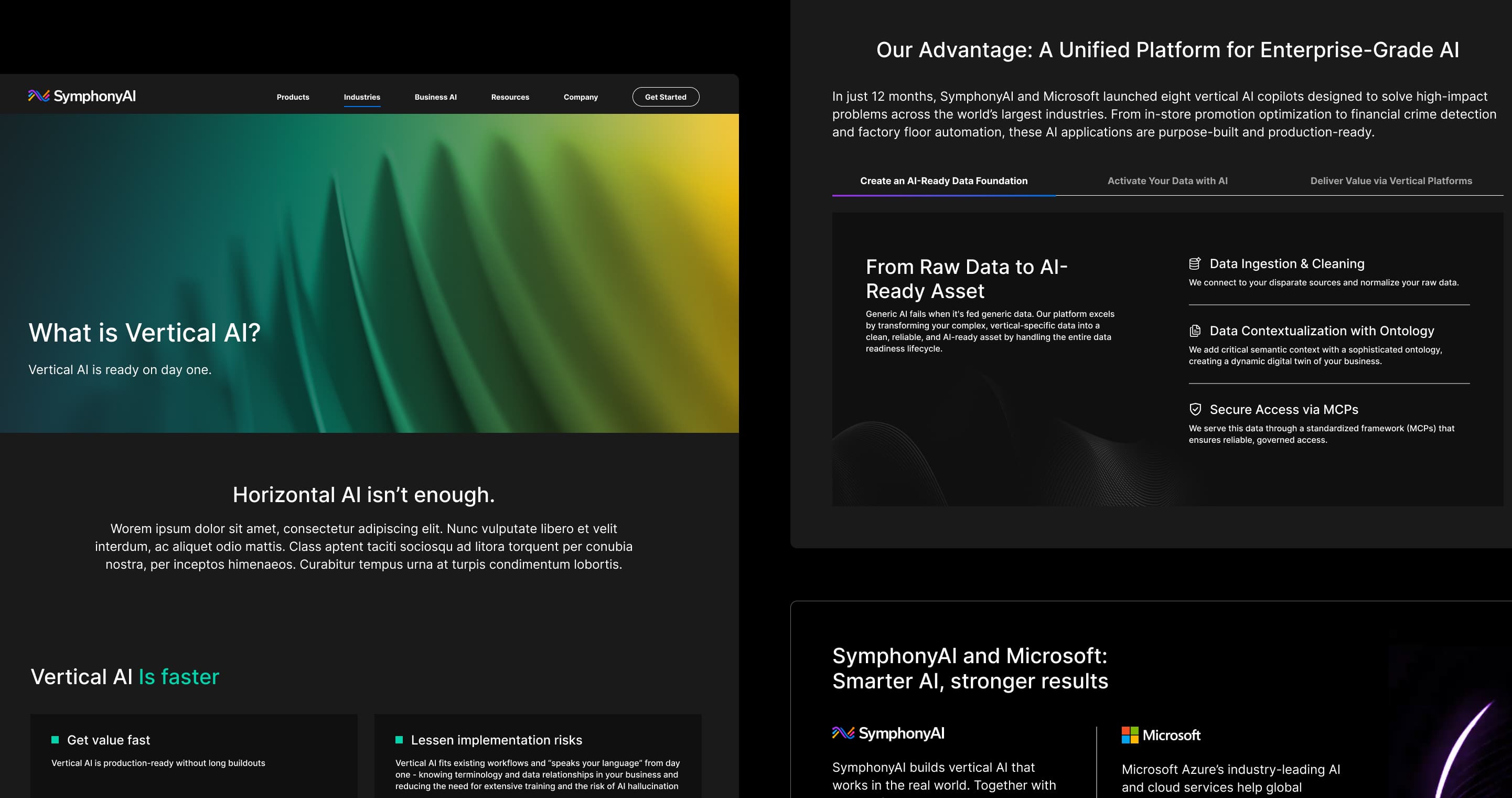
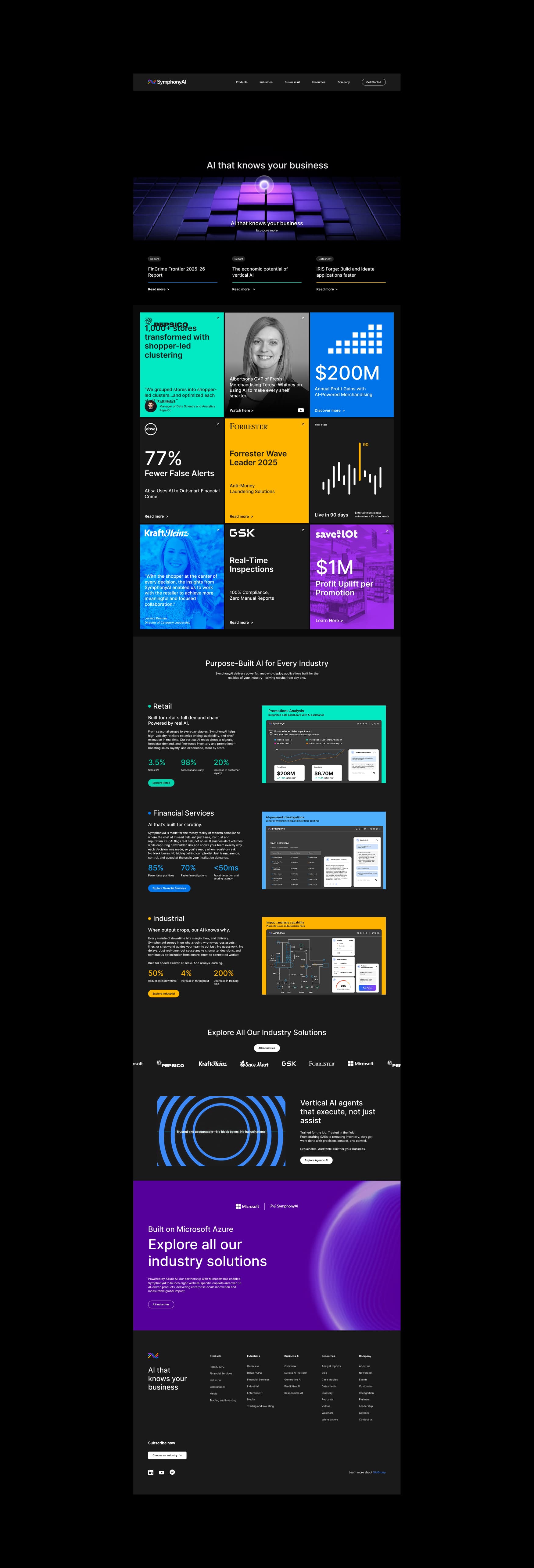
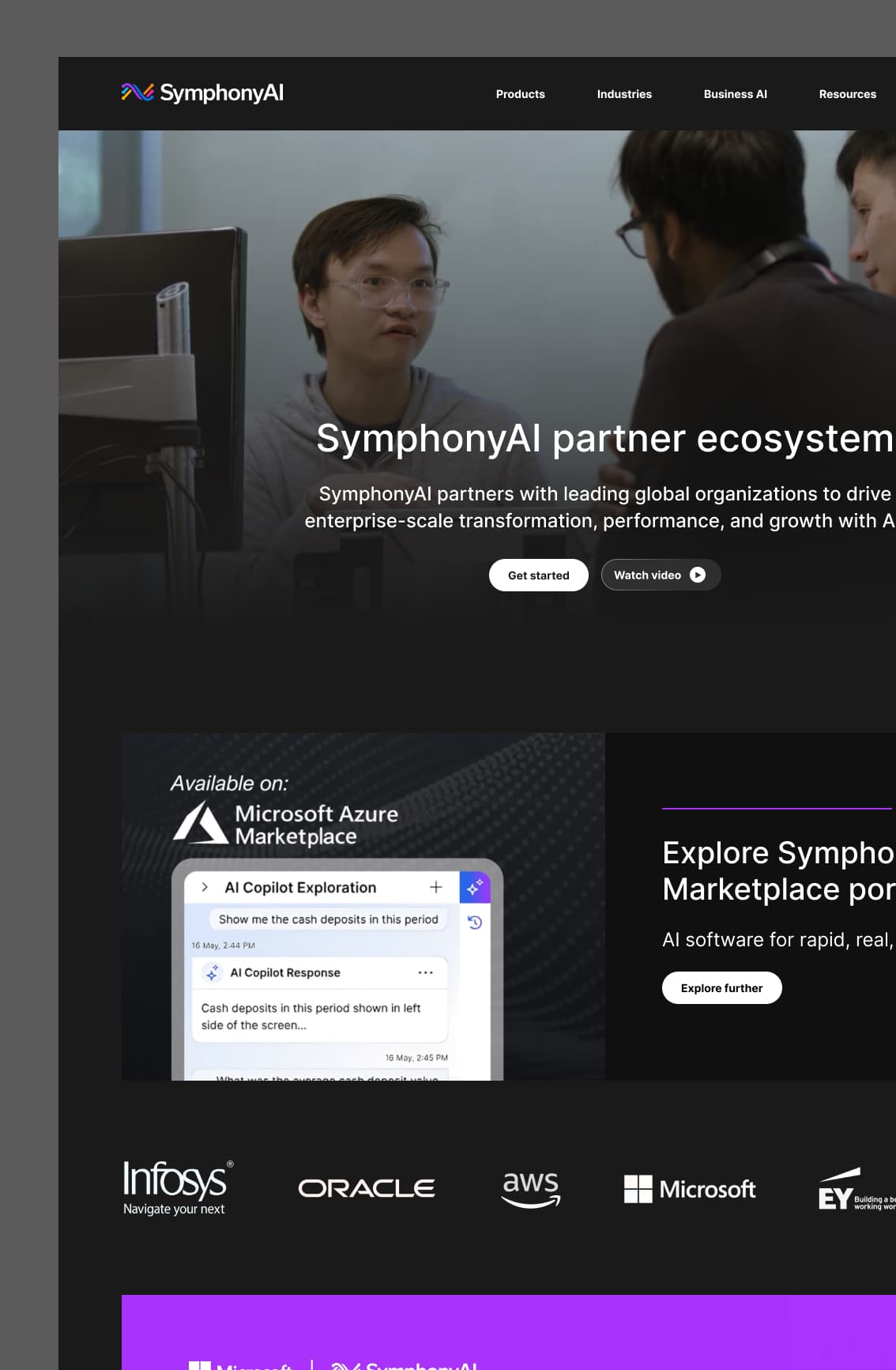
SymphonyAI builds specialized, industry-specific enterprise AI applications for the world's largest companies — automating workflows, preventing financial crime, optimizing supply chains, and improving manufacturing efficiency across retail, financial services, industrial, media, and enterprise IT. This isn't a general-purpose AI tool. It's a purpose-built platform with distinct verticals, deep domain expertise, and a global enterprise customer base including PepsiCo, KraftHeinz, GSK, and Microsoft.
We've been SymphonyAI's design partner for two years. When they underwent a full brand refresh, the challenge wasn't just updating the look. It was applying a new visual identity to one of the most complex information architectures we've worked with, improving the overall user experience, and building a design system that could scale with a rapidly expanding product portfolio.
02
PAINPOINTS / CHALLENGEGS
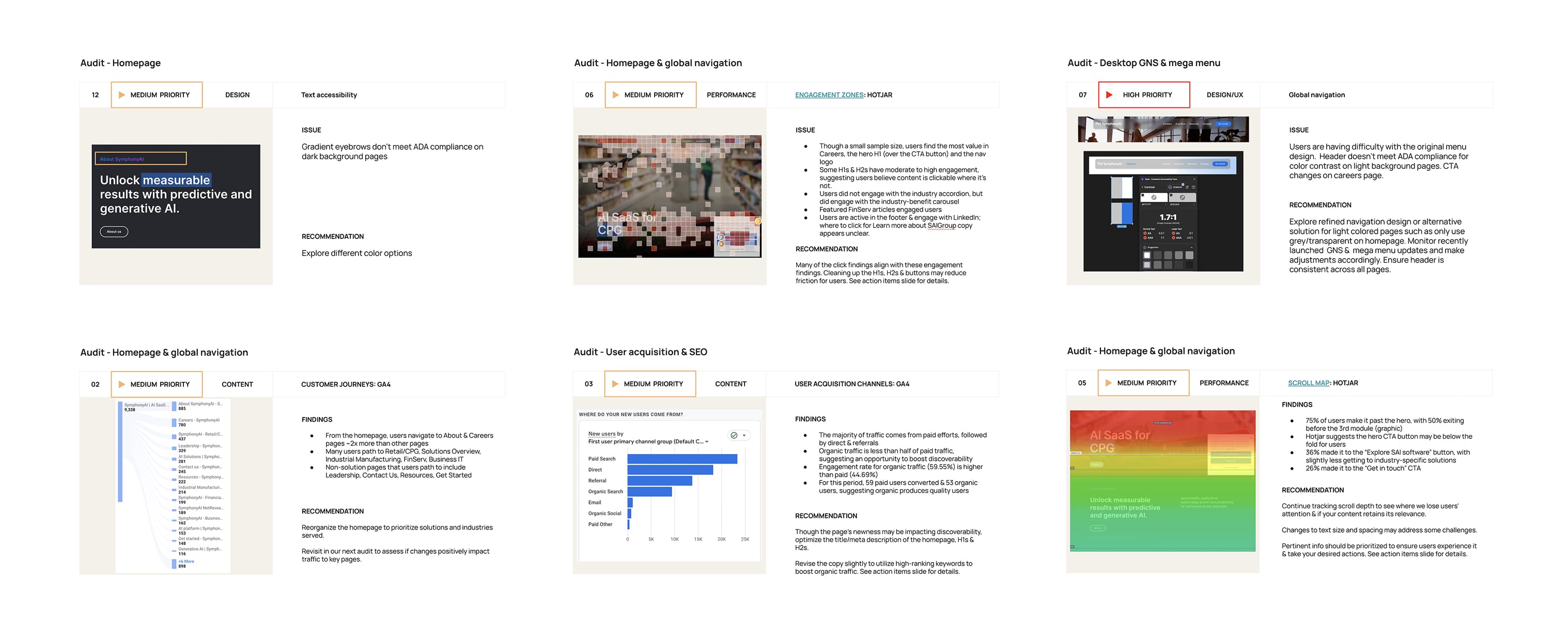
The previous site had grown organically without a governing visual system, which showed. The UX audit we conducted using Google Analytics and Hotjar revealed that users were navigating to About and Careers pages twice as often as to core solution pages, that many users were clicking on non-interactive elements suggesting unclear pathways, and that over half were dropping off before reaching industry-specific content. The visual language was inconsistent across verticals, making it difficult for enterprise buyers to quickly identify the solutions most relevant to their industry. The site was ambitious in scope but wasn't converting that ambition into clarity.
03
GOALS
We set out to accomplish four things. First, apply SymphonyAI's new brand identity to the web experience in a way that felt coherent across a large, complex site. Second, redesign the information architecture so enterprise buyers could navigate directly to their industry and get to the right content faster. Third, build a design system rigorous enough to house all existing content and scale with new product launches, verticals, and campaigns without losing visual fidelity. Fourth, establish a monitoring framework: quarterly audits, KPI tracking, and SEO optimization to support long-term organic growth alongside the design work.
04
DESIGN PROCESS
We started where the problems were. The UX and UI audit gave us a clear picture of how users were actually moving through the site versus how SymphonyAI hoped they would. From there we restructured the information architecture to prioritize solution and industry pages, and developed a content strategy that put the most conversion-relevant content higher in the user journey.
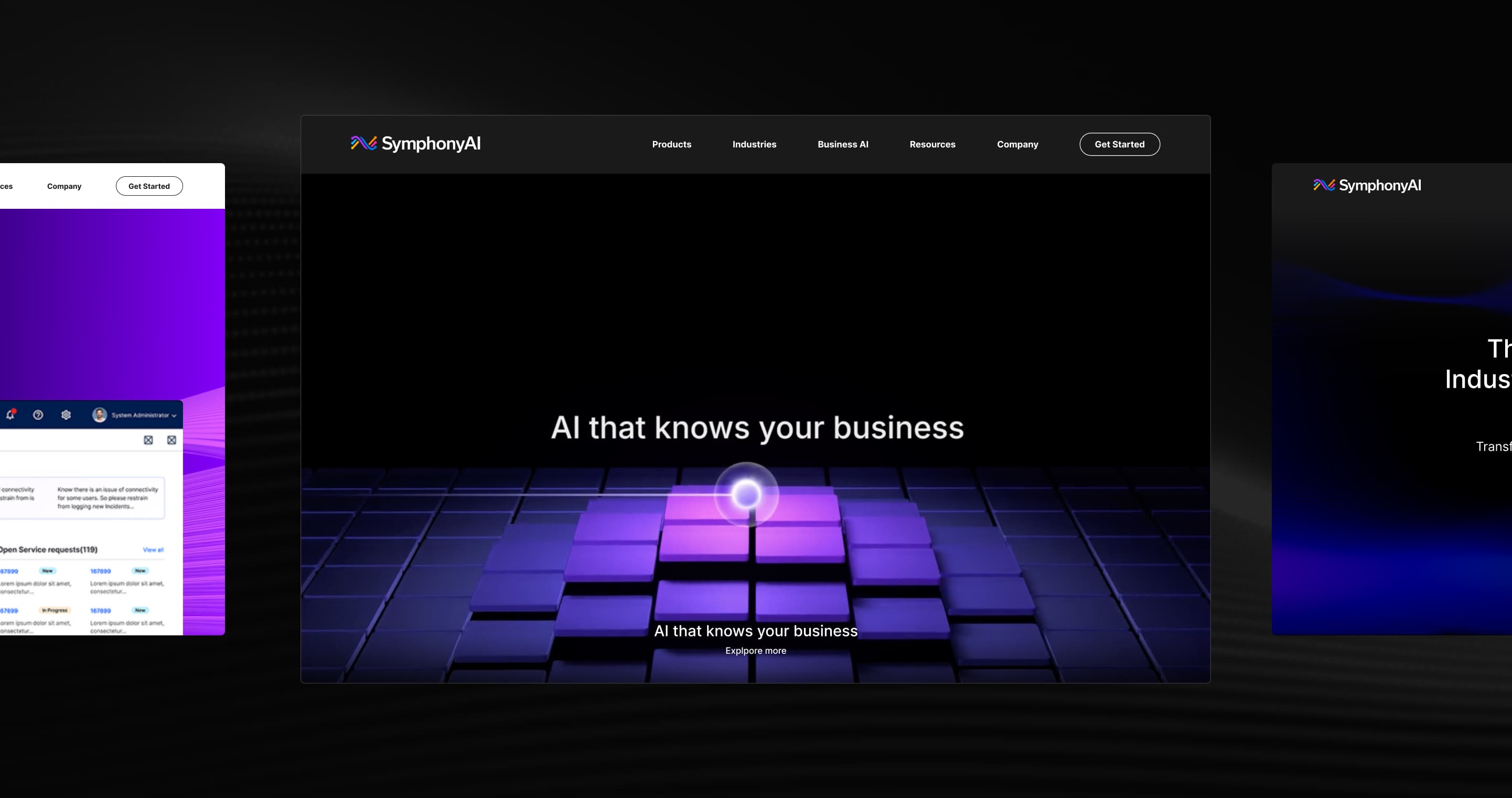
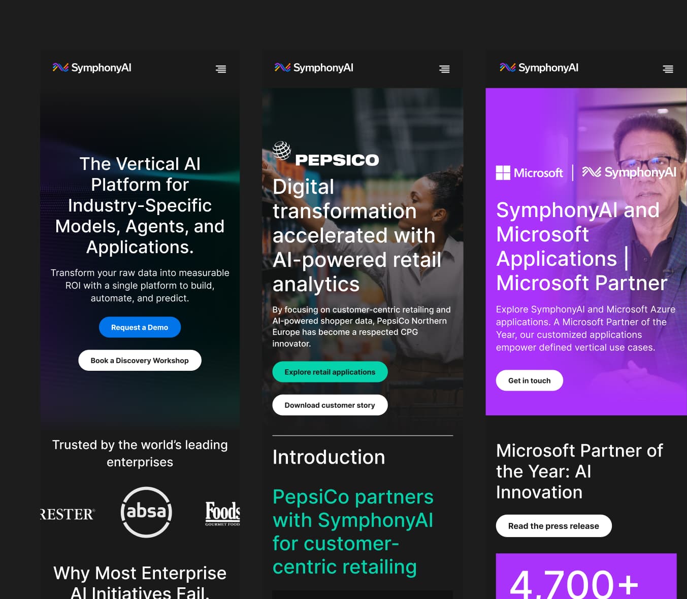
For visual direction, the new brand gave us strong foundations. The design challenge was translating a bold, sophisticated brand identity into a system that could work across five distinct industry verticals, a rapidly expanding product portfolio, and a content library that included everything from technical documentation to enterprise case studies. We explored multiple homepage directions before landing on a visual language that felt authoritative and precise without sacrificing warmth.
Site performance was a constraint we designed around from the start. SymphonyAI's ambition for rich visual storytelling and motion had to be balanced against enterprise users on a range of devices and network conditions. Every motion decision was intentional, and we monitored site speed throughout to ensure craft and performance weren't in conflict.
05
DESIGN SYSTEM & COMPONENT LIBRARY
As with every Baunfire engagement, we built a system before we built pages. For SymphonyAI, the scale of that system was significant: a brand refresh applied to an existing site with dozens of pages, multiple product lines, and five distinct industry verticals all needing to feel coherent within a single visual language.
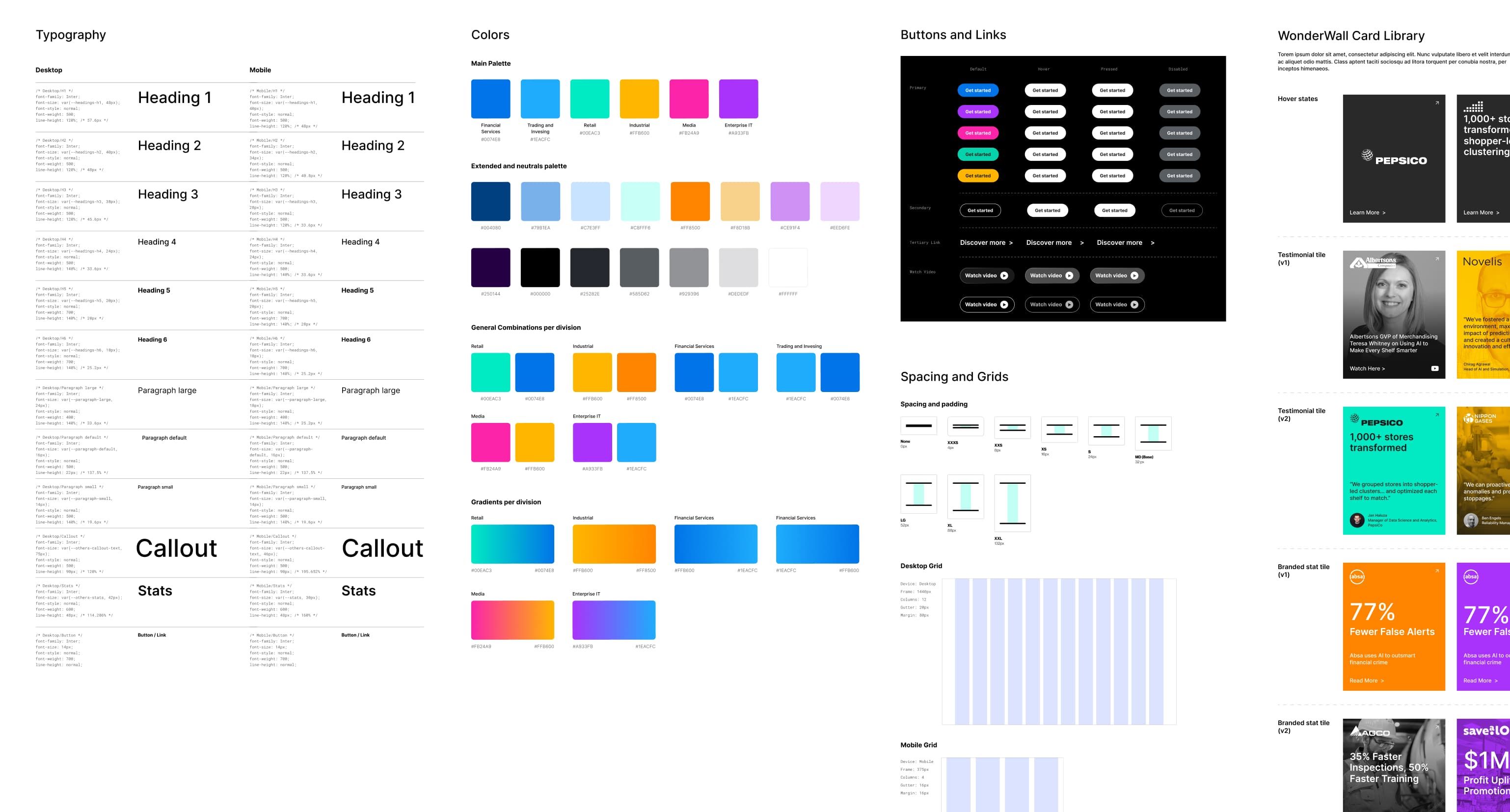
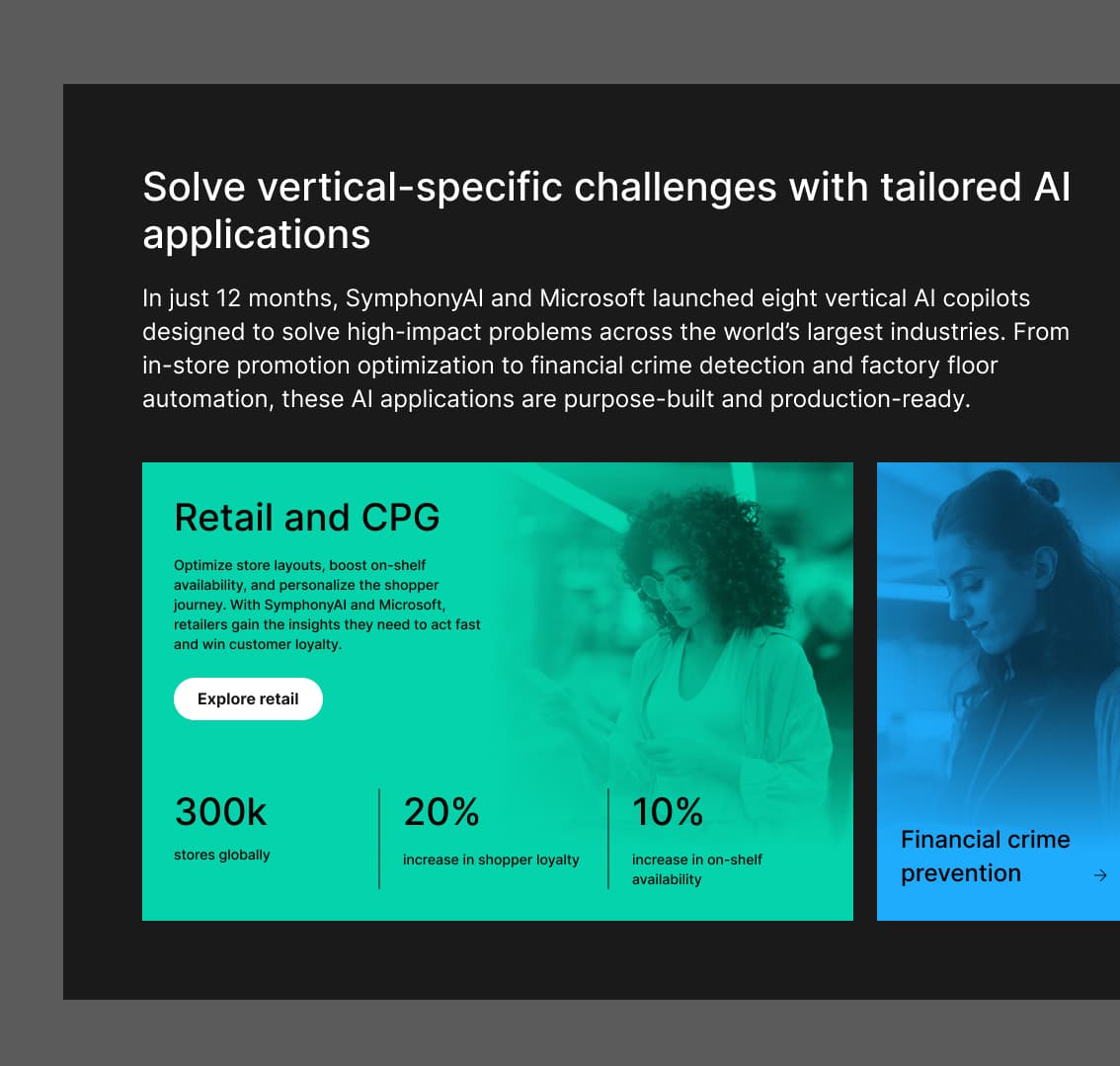
The style guide translates SymphonyAI's new brand identity into a web-specific visual language. Typography, color, spacing, and grid decisions were all made to reflect the brand's positioning: sophisticated enterprise AI that delivers measurable results, not generic capability. The color system goes beyond brand expression. Each of SymphonyAI's five industry verticals, Retail, Financial Services, Industrial, Media, and Enterprise IT, is assigned a distinct color identity, giving users an immediate visual orientation as they navigate between solutions. The gradient system follows the same logic, with division-specific gradient treatments that carry the color coding into hero moments and campaign surfaces. The result is a visual system where brand consistency and navigational clarity reinforce each other.
The component library is what makes scale possible on a site this size. Every section type is organized into a modular, categorized toolkit: Navigation and Footer, Hero, Features, Numbers, Carousel, Testimonials and Logos, Resources, CTA, and Accordion, each documented across desktop and mobile with all states accounted for. A standout element is the WonderWall card library: a flexible, brand-expressive content format that houses customer proof points, statistics, testimonials, and campaign moments in a system that can be assembled and extended without design involvement on every update. The goal throughout was to give SymphonyAI's internal team the freedom to build and maintain the site independently, within a system opinionated enough to protect the brand.
05
TAKEAWAY & OUTCOMES
The site launched January 16, 2025 and delivered measurable results almost immediately. Influenced S2+ opportunities increased 176% post-launch, with qualified pipeline value growing from $1.6M to $3.9M, a 144% lift. Organic sessions grew 27.5% YoY by August, non-branded search clicks were up 46%, and page 1 keyword rankings climbed 41% year-over-year. The redesigned homepage achieved a 25% bounce rate, well below industry benchmarks, and drove 30% more demo request clicks after the hero CTA was updated. The engagement became an ongoing retainer, with monthly performance reviews informing continuous iteration. The real outcome wasn't just a better-looking site. It was a website that worked measurably harder for the business.